Whether it's marketing infographics, scary climate change graphs, or government statistics, we're all getting used to seeing (and interpreting) meaningful data EVERY SINGLE DAY.
Unquestionably, schools are underpinned by enormous amounts of data.
Pupil absence. Progress measurements. Free school meal eligibility. Safeguarding incidents. Exam results.
It’s a never ending torrent of statistics, YOY comparisons, and spreadsheets.
For the most part teachers are well used to seeing and interpreting data.
Nonetheless this is a disadvantage when marketing to schools.
How can you make YOUR data eye catching enough to compete against the tsunami of data educators deal with every day?
If visual content is processed 60,000 times faster than text, and 65% of us are visual learners… then you need to present it in a more visual way.
Eye-catching infographics
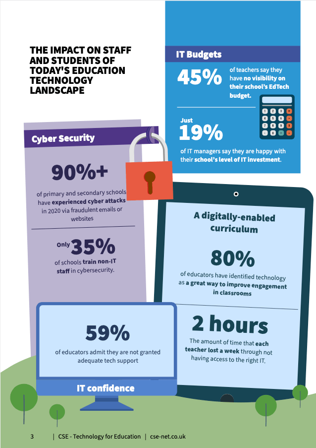
Infographics are a way to keep your audience focused on the key data points that help tell the story you want to tell.
They’re easy to share and could become link backs for your site which improves your Google rankings.
They also position you as an expert, thereby enhancing your brand’s credibility.
Rich reports
Create a story around your data with premium gated reports.
- The numbers themselves are one thing – but what’s the real-world impact?
- Think about who you’re targeting with reports – is it new leads, customers, or your online community?
- Tailor the story to agitate, excite, or pull on their heart strings. Just sticking a report behind a sign-up form isn’t a strategy.
Groovy graphics
Turn key stats or pull quotes into static text images, animated videos, or GIFs. Like infographics, these can easily be shared and distributed, and they make interesting social posts.
Our top tools to visualise meaningful data
- Tools like Adobe Creative Cloud Express and Canva have infographic options in their considerable template libraries.
- Pikotochart infographic maker and Visme Infographic creator are both visual design tools that have infographic builders.
- Venngage is a dedicated infographic builder.
Of course, all these tools rely on templates.
If you want something unique for a big campaign then your best bet is to commission a skilled designer. We’ve got some excellent freelance designers on our books so let us know if you’d like to be connected.
Psst! Want even more exclusive marketing to teachers advice?
TAIT, our marketing to schools newsletter, hits the inboxes of our industry’s smartest education marketing professionals every other Wednesday.
