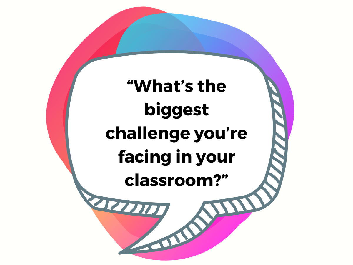
Picture this: an educator sees one of your ads, follows the link to the landing page, and sees a headline at the top that reads:
“What’s the biggest challenge you’re facing in your classroom?”
…with a search bar below it.
Just like Google.
Would it work? Would it make your prospect stop and think?
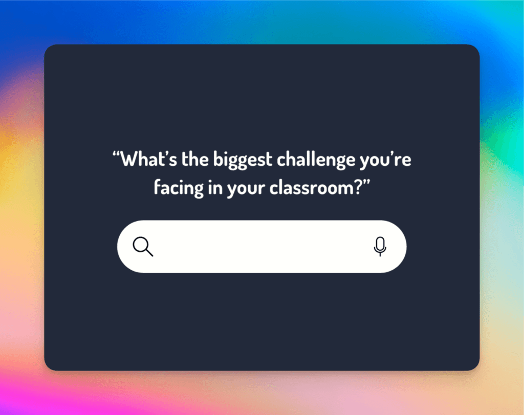
How a question-led landing page design can capture educators' attention and personalise their journey. (Just like a certain search engine does!)
This came up on one of our Bee Digital weekly team calls. The topic of conversation: A/B testing landing pages with different hero banner formats. Yes, we are marketing geeks.
Typically, for a landing page promoting a downloadable guide or webinar, we recommend focusing on a single promise that addresses *one* key pain point. This clear, strong message will prompt action.
But what’s great about this Google-y concept is you can be focused and cover multiple pain points.
You’re also actively engaging anyone who lands on the page to take immediate action by leveraging a format we are all familiar with. When we see a search bar, we automatically know what it is, how it works, and what to do next.
With a discovery-style feature as the focus of your landing page, you can…
Make it all about them...
…with a function that makes it easy to find relevant content, you will enhance their experience, improve engagement, and reduce bounce rates by piquing their interest.
Imagine landing on a page where you can type in “student engagement strategies,” you’re immediately guided to relevant resources.
Or a teacher could search for “time management tips” and be directed to a blog or webinar dedicated to that topic. You’re creating a personalised journey from the very first click.
Boost interactivity and happy feelings...
…because educators will be encouraged to explore more and connect with your brand, it creates a positive experience that builds trust.
For example, a platform like Edmentum could use this concept to enhance its teacher resource section.
Educators would have the freedom to input their specific needs—whether it’s curriculum support or formative assessments—and be taken to tailored content.
This creates a positive user experience that builds trust because the visitor feels the page is truly there to serve them rather than push a product.
Speak directly to their diverse needs...
…by letting visitors quickly find specific content/ support, avoiding generic messaging, and ensuring all audience segments are effectively reached.
Take, for instance, a tool like Pear Deck.
If their landing page included a search bar where teachers could input queries like “engaging students with slides,” they could be directed to specific case studies, templates, or articles.
This way, educators can find the content they need, avoid irrelevant information, and connect more deeply with their brand.
BONUS TIP
Consider segmenting your audience with pre-populated search suggestions. If a teacher types “classroom management,” the drop-down suggestions could include options like primary school, secondary school, or special education to guide them even further.
Get straight to the point and increase conversions...
…with tailored search results paired with precise calls-to-action, this effectively streamlines their path from inquiry to action.
Optimise your own SEO...
…by improving internal linking through a search feature, you enhance site SEO and visibility in external search engines.
Focusing SEO efforts on frequently searched content/ pages can drive more traffic to pages that resonate more with your audience.
Sounding a bit complicated? Turn the search bar concept into a:
✨ Pre-loaded drop-down menu
List the specific needs/ pain points experienced by your target audience. When a choice is selected, direct the prospect to a landing page with more information, resources, and a call to action. This means you can track trends and gain valuable insights based on the options chosen.
✨ Survey or quiz-type form
Create a set of questions that uses question logic to cleverly divert teachers to pages that fit their needs.
✨ Chatbot journey
Make the act of choosing more interactive with a series of questions and answers. It’s a fun way to gamify the experience, and you have so much freedom with the tone and personality of your Chatbot’s responses. With apps like Botstar, you can add some fun GIFs and memes to the mix, too!
What works best? Testing your search-driven page
A/B testing is crucial to ensure that this approach resonates with your audience.
You might find that certain phrasing in the search question, or the placement of the search bar itself, leads to better engagement.
Try different hero banner designs—one with a search bar, one with a pre-loaded drop-down, and another with a strong, single-message CTA – and compare conversion rates.
The data will tell you what truly works.
Time to get creative with your landing pages
A search-engine-inspired landing page isn’t just a gimmick – it’s a strategy rooted in understanding your audience’s needs and creating a frictionless journey for them.
By making your landing page feel intuitive and personalised, you can increase engagement, build trust, and drive more conversions.
So, the next time you design a landing page, think beyond the typical headline and call to action…
Ask a question.
Add a search bar.
Get creative, and see how you can truly meet your audience where they are.
Go on, and test your Google-iness.