There are obvious places where “marketing” happens.
Like billboards, podcast sponsorships, Facebook ads, and so on.
But your marketing to schools landscape is so much richer with opportunity than it appears on the surface.
You have to consider every touch point teachers have with your brand and product, no matter how small.
If you don’t seek marketing details outside the typical places then you are missing the hidden opportunities in marketing to education.
Thank you and confirmation pages
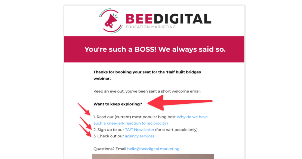
It pays to be polite, but have you added things for teachers to explore after they’ve successfully filled out your free trial form?
Thank you pages aren’t just a mechanical way to measure your conversions but can also be a spectacularly useful way to get people to jump off into other areas of your website.
After all, your prospect JUST signed up for a webinar, lead magnet, or newsletter – they’re into you right now so keep the conversation going!
Try adding links to:
- Your best performing blog posts(s)
- Pricing
- About your team
- Customer success stories
- Your social media channels
Operational messaging
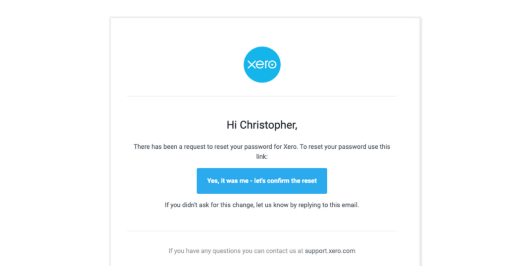
Why make a beautiful website if your support and operational language is basic and off brand?
If someone forgets their login password make the reminder experience as joyful and on brand as everything else (while still being clear and to the point)!
Also consider:
- Delivery emails
- Order confirmation emails
- Form error messages
- Survey and NPS request emails
404 pages
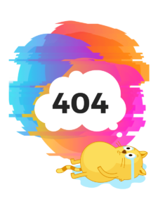
404 pages are what gets served when someone tries to access a missing page or misspelled URL on your website.
Like Thank You pages, you should utilise the page’s prime real estate to help keep visitors on your site, and seize the opportunity to make them smile.
- Create your design. (Here are some tips to customise your 404 page.)
- Choose an image, meme, or animation that’s bright and witty.
- Consider a conversational tone to address the situation, and alleviate frustration.
- Think about a CTA button to include, such as ‘Keep shopping’, ‘In the meantime, check out our blog…’, etc.
It’s a great hidden marketing Easter egg your competitors are likely to overlook, and it will stand out as a memorable customer experience.
Staff email signatures

Your team, especially customer support, probably send out hundreds of emails a month to leads and customers.
Their email signature probably contains the usual things – job title, phone number, business address etc. Maybe even your company Facebook and Twitter.
Sure, that stuff is important but why not add a PS to take advantage of this free space?
- Are you promoting a newsletter?
- Are you hosting an event?
- Are you supporting a charity?
- Have you recently launched a new product?
Keep your email signature fresh and up to date with relevant and helpful promotions, perhaps once a quarter. Don’t crowd the plate, but don’t ignore this micro marketing opportunity either.
Social media bios
When a prospective customer scopes you out before buying (and they almost certainly will) they’ll jump into your social channels.
And what better way to lose them than with a boring, unhelpful, or uninspiring social media bio?
It’s important to have brand consistency across your social channels but that doesn’t mean using the same copy in each. After all, your Youtube channel may serve a different purpose (educating customers) to your Twitter channel (knowledge coaching) to your Linked in (thought leadership).
Top tip: It sounds counter intuitive but don’t use this space to describe your company/product. Show your visitor what they can expect to get when they browse your posts/tweets etc.

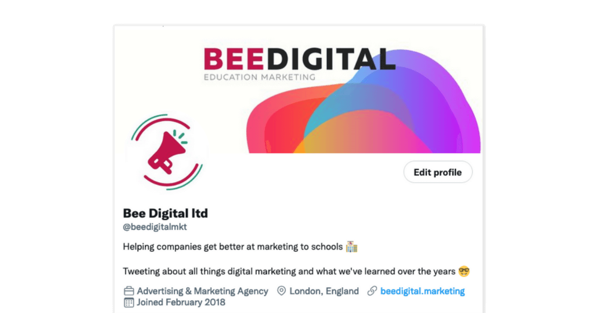
 “Helping companies get better at marketing to school and tweeting about all things digital marketing and what we’ve learned over the years”
Start and end slides in your presentations
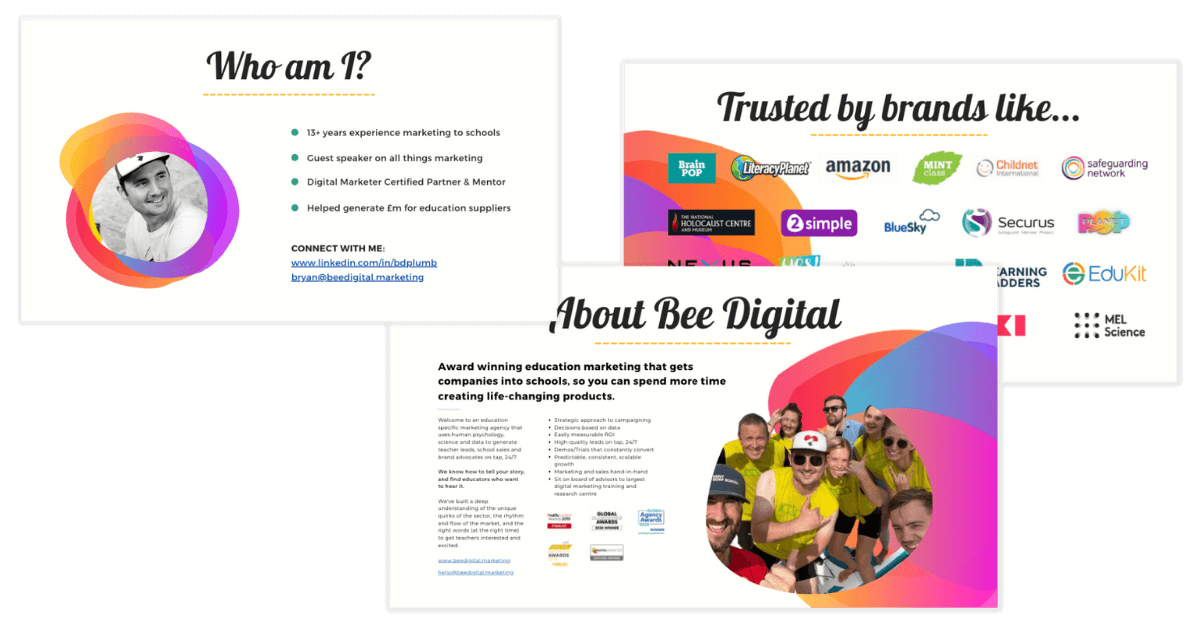
Powerpoint, like Thanos, is…inevitable.
At some point you are going to have to present an idea, sales pitch, or webinar.
So lean into the marketing moment it creates.
- You have an interested audience (they signed up to your webinar)
- You have intent (they turned up)
- You have permission to follow up (“Send me the presentation deck after, please”)
Preface your presentation with a slide that explains who you are (photo too!), what you offer, and why you’re qualified.
End your deck with a slide of customer testimonials and more follow up, link to your landing page, and contact info.
Why make all this effort? So that when you deck gets shared with other stakeholders in the school everyone gets to see who you are, what you do, and why you’re credible.
Miss that out at your peril.
Zoom backgrounds

Do you use a customised Zoom/Microsoft Teams meeting background?
Or is it just your bookshelf, some faded flowers, or a blank wall?
If you are on any kind of sales demo using video conferencing then design a beautiful on brand background (Canva has a great selection of Zoom templates). You could use it to show your product, logo, and name/title.
It will save your blushes and reinforce who your audience is watching.
PS Just be careful to only change your background, and not your filter…
my boss turned herself into a potato on our Microsoft teams meeting and can’t figure out how to turn the setting off, so she was just stuck like this the entire meeting pic.twitter.com/uHLgJUOsXk
— Rachele Clegg (@PettyClegg) March 30, 2020
App update copy in app store
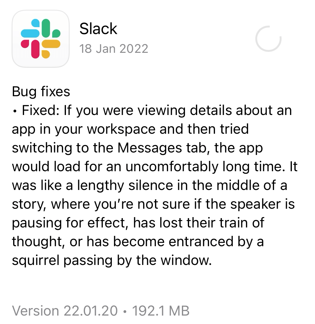
If you have an App, then you will at some point have to make an update.
And that’s a <chef’s kiss> perfect time to do a little bit of microcopy magic.
Use the update text to remind users what your app does best, why this update is worth doing, and maybe throw in a bit of humour into the mix.
Because operational does NOT mean boring.
Business correspondence
There’s a whole underbelly of little marketing moments buried in your company paperwork that you might be ignoring because it’s not sexy.
But these are the nuts and bolts of your business and deserve as much attention and polish as an advertorial in Teach Primary.
Why? Because while most people will ignore your marketing emails there’s a solid chance every one of your prospects and customers will interact with your back office processes and you want them to shine with your brand style, values, and service.
Delight people with plain english, conversational copy, and clear design. Don’t be afraid to leave the occasional easter egg too – people love to discover secrets!
Take a look at the following list and ask yourself: how can ours be more remarkable?
- Business cards (need inspiration for creative business card design?)
- Headed notepaper/correspondence
- Invoices; Receipts
- Contracts
- Quotes
- Privacy agreements
- Cookie policies
- Out of Office emails
Comment in social Ad threads
Facebook will only show your organic posts to about 2% of your followers. Even ones that asked to hear from you.
So you do an Ad, which you want to reach as many of your target audience as possible.
And to facilitate this you should interact with user comments AS QUICKLY and ENGAGINGLY as you can.
Facebook themselves say “Page posts that generate conversation between people will show higher in News Feed” so make sure your marketing and customer service team are in the comment weeds and answering queries and representing your brand.
The more chatter your post generates the more Facebook interprets that as engagement and boom, shows your post to more people.
People will be delighted by your attention and more likely to feel you’re a brand they can trust (and buy from).
Miniture marketing moments

There are hundreds of other ways you can, and should, be looking at your business through a marketing microscope.
When you take a cumulative view of your marketing (and don’t leave it siloed to the marketing team) it will reassure your customers that you are a company worth doing business with.
Consider reviewing and updating these other less obvious but no less important marketing opportunities:
- FAQs – users often browse support pages before buying.
- Voicemail messages – how is your brand or offers represented in your phone queue and VM messages?
- In your URLs – are they friendly?
- Gmail picture avatars – don’t let email clients use a default image – upload your photo or brand imagery.
- Use links in your captions – they are strangely good at converting!
